Ranking isn't the problem. Booked jobs are.
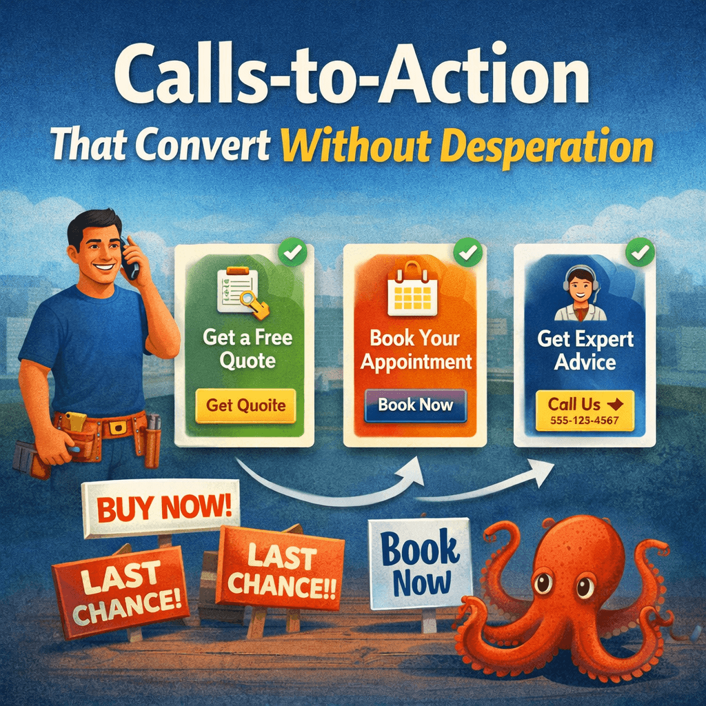
Calls-to-Action That Convert Without Desperation
A call to action should help the visitor take the next step. It should not sound needy, vague, or overly aggressive.
A lot of service pages lose leads because the page never clearly guides the visitor forward. Other pages overcorrect and sound pushy. Neither works well.
The best calls to action are clear, direct, and easy to act on. They reduce hesitation without creating pressure.
If your page is getting traffic but not enough response, this is often part of the bigger problem behind Why Most Service Pages Don’t Convert.
Start with the Pipeline Profit Inspection if your pages are visible but the next step is not producing enough booked jobs.
What a call to action is supposed to do
A call to action is not there to “sell harder.” It is there to remove uncertainty around what the visitor should do next.
That next step might be:
- call now
- request an estimate
- book an appointment
- send a message
If the page does not make that next step obvious, people stall. That is one reason businesses end up getting traffic but no calls.
For the larger structure model, see How to Structure Service Pages That Turn Traffic Into Booked Jobs.
Why some calls to action do not convert
Most weak calls to action fail in one of two ways:
- they are too vague
- they are too forceful
A vague CTA sounds like:
- Learn more
- Get started
- Contact us
Those phrases are not always wrong, but they often fail to tell the visitor what will actually happen next.
An overly aggressive CTA sounds like:
- Act now before it’s too late
- Claim your spot today
- Don’t miss out
That language can feel out of place on local service pages. It creates pressure when the better move is clarity.
What better CTA language sounds like
A strong CTA usually sounds calm, direct, and specific. It tells the visitor what to do and what kind of action they are taking.
Examples:
- Call to schedule service
- Request an estimate
- Book a consultation
- Get pricing
- Ask about availability
This kind of language works because it matches real service-business behavior. It sounds like a next step, not a sales script.
Placement matters as much as wording
A good CTA can still underperform if it is buried.
Most service pages need the next step to appear in more than one place, usually:
- near the top of the page
- after key trust or service details
- near the bottom for visitors who read further
Visitors do not all act at the same point. Some decide quickly. Others need more proof first.
That is why CTA structure is part of the larger Anatomy of a High-Converting Service Page.
Low-friction CTAs usually perform better
The next step should feel easy. If the CTA leads into a hard, clunky, or unclear handoff, conversions drop.
That friction can look like:
- a long form
- too many required fields
- unclear contact expectations
- no indication of what happens after submission
- a buried phone number on mobile
The point of the CTA is not just to exist. The point is to make action feel simple.
CTA wording should match the page intent
A service page should use CTA language that fits the service and the stage of decision.
For example:
- Urgent service: Call now, request service, get help today
- Estimate-based service: Request an estimate, get pricing, ask for a quote
- Consultative service: Book a consultation, schedule a call, request an appointment
When the CTA matches the page intent, the visitor feels less friction. When it does not, the page feels off. That is similar to the issue covered in Traffic vs Buying Intent.
What CTAs should avoid
Most service pages should avoid CTAs that are:
- generic
- overhyped
- unclear
- too numerous
- inconsistent across the page
If every section pushes a different action, the visitor hesitates. If the language sounds too polished or too salesy, trust drops.
Trust supports the CTA
A CTA does not work alone. It works better when the page has already built enough confidence for someone to act.
That is why CTA performance depends on:
- headline clarity
- service explanation
- reviews or proof
- clear service area fit
- overall page structure
If those things are weak, the CTA will not carry the page by itself. That is one of the common visibility-to-call breakdowns.
Mobile CTA behavior matters
A lot of local service traffic happens on mobile. That means the CTA should be easy to find and easy to use on a phone.
Common problems:
- button too far down the page
- phone number hard to tap
- form too long on mobile
- CTA lost inside clutter
If the mobile handoff is weak, the page can get real traffic and still lose calls. That is part of the broader pattern behind Why Impressions Don’t Equal Revenue.
Examples of stronger CTA phrasing
- Call to schedule service
- Request a quote
- Book an appointment
- Ask about availability
- Get an estimate
- Talk with our team
These work because they are simple and concrete. They tell the visitor what action they are taking without trying too hard.
What to do next
If your service page CTA is underperforming, do not just change button color or wording in isolation. Look at the whole page path:
- Does the page build enough trust before the CTA appears?
- Is the next step obvious?
- Does the action feel low-friction?
- Does the CTA match the type of service being offered?
If you want to see how this fits into the larger page structure, review Homepage vs Service Page Hierarchy and Before-and-After Service Page Structure Examples.
If your pages are visible but not producing enough booked jobs, the Pipeline Profit Inspection helps identify whether the problem is the CTA, the page structure, the intent match, or the handoff.
- Home
- Service Page Structure
- Calls-to-Action That Convert